Chapter 9 of 25 — contents
- 01What a Trading Engine Actually Is
- 02qkt as a Subject
- 03The Event Bus
- 04Candles
- 05Position Tracking and P&L
- 06The Risk Engine
- 07Exact Arithmetic
- 08Deterministic Replay
- 09Backtest Reporting
- 10Parameter Sweeps and Walk-Forward Analysis
- 11Backtest Fidelity
- 12Why a DSL
- 13Parsing and Compiling
- 14Indicators
- 15Historical Data
- 16The Live Runtime
- 17Brokers
- 18The Order Lifecycle
- 19Resilience
- 20Backtest/Live Parity
- 21Portfolios
- 22Observability
- 23Performance
- 24One Strategy, End to End
- 25What Building qkt Teaches About Trading Systems in General
Backtest Reporting
The number that lies by omission#
Two strategies finish a backtest with the exact same headline: total P&L of $10,000. Strategy A made it in one enormous trade in the third week, and was flat or slightly losing everywhere else. Strategy B made it in a hundred small, steady wins spread evenly across the whole run. If all you look at is the one number both reports lead with, they’re identical — equally good, equally fundable, equally safe to run with real money next. They are not remotely the same thing. Strategy A is one lucky (or one catastrophically risky) trade away from giving it all back; Strategy B has already survived a hundred independent tests of whether its edge is real.
Total P&L can’t tell these two apart because it collapses an entire history — every high, every low, every stretch of pain along the way — into a single scalar. Everything this chapter covers exists to put that shape back. A backtest report isn’t one number; it’s a small family of numbers, each one asking a genuinely different question about the same run, and the report only does its job if you understand what each question actually is.
The equity curve is the real substrate#
Every one of these numbers is computed from the same underlying thing: a running record of the account’s total value over time — not just closed trades, but equity at each reading, the same figure Chapter 6 built for the risk engine (realized profit plus whatever’s currently floating, unrealized, on open positions):
data class EquitySample(val timestamp: Long, val equity: BigDecimal)Notice that the field is equity — the account’s whole value — and not the running profit-and-loss starting from zero, which is the more obvious thing to record and what a lot of tooling plots. That choice decides whether every number built on top of it means anything. Track profit from zero and the metrics go capital-blind: a curve that climbs to $500 and falls back to $250 has, on its own terms, lost half of everything. Report that as a 50% drawdown and it sounds like a catastrophe. On a $10,000 account it was a 2.5% dip. The percentages that follow — drawdown, and every ratio built from returns — are only meaningful relative to the capital at risk, so the capital has to be in the series rather than subtracted out of it.
A “reading” doesn’t happen continuously — something has to decide when to sample, and that choice is a real tradeoff, not a formality. Sample on every tick and you get the smoothest possible picture at the cost of enormous volume and noise dominated by nothing happening. Sample only on fills and you get a clean, sparse series — but you’d miss the shape of the ride between trades entirely: a position that spent three days deeply underwater before finally recovering to a win looks, on a fills-only curve, exactly like a position that went straight up. qkt exposes the choice explicitly rather than picking one silently:
enum class SampleCadence { TICK, CANDLE_CLOSE, FILL }Candle-close is the common middle ground — one reading per finished bar, dense enough to capture real intra-run pain, sparse enough not to drown in tick noise.
One reading, two destinations, one shared idiom#
Here’s a genuine memory problem hiding underneath a seemingly simple idea. A backtest over months of tick data can produce millions of equity readings. Keep every single one in memory to compute “the maximum drawdown across the whole run” and a long enough backtest exhausts the machine running it. But you also can’t just throw old readings away — the exact metrics need to see every sample, not a thinned-out sketch of the run, or “max drawdown” stops meaning what it claims to mean.
qkt resolves this by giving each equity reading two separate destinations with two separate memory budgets:
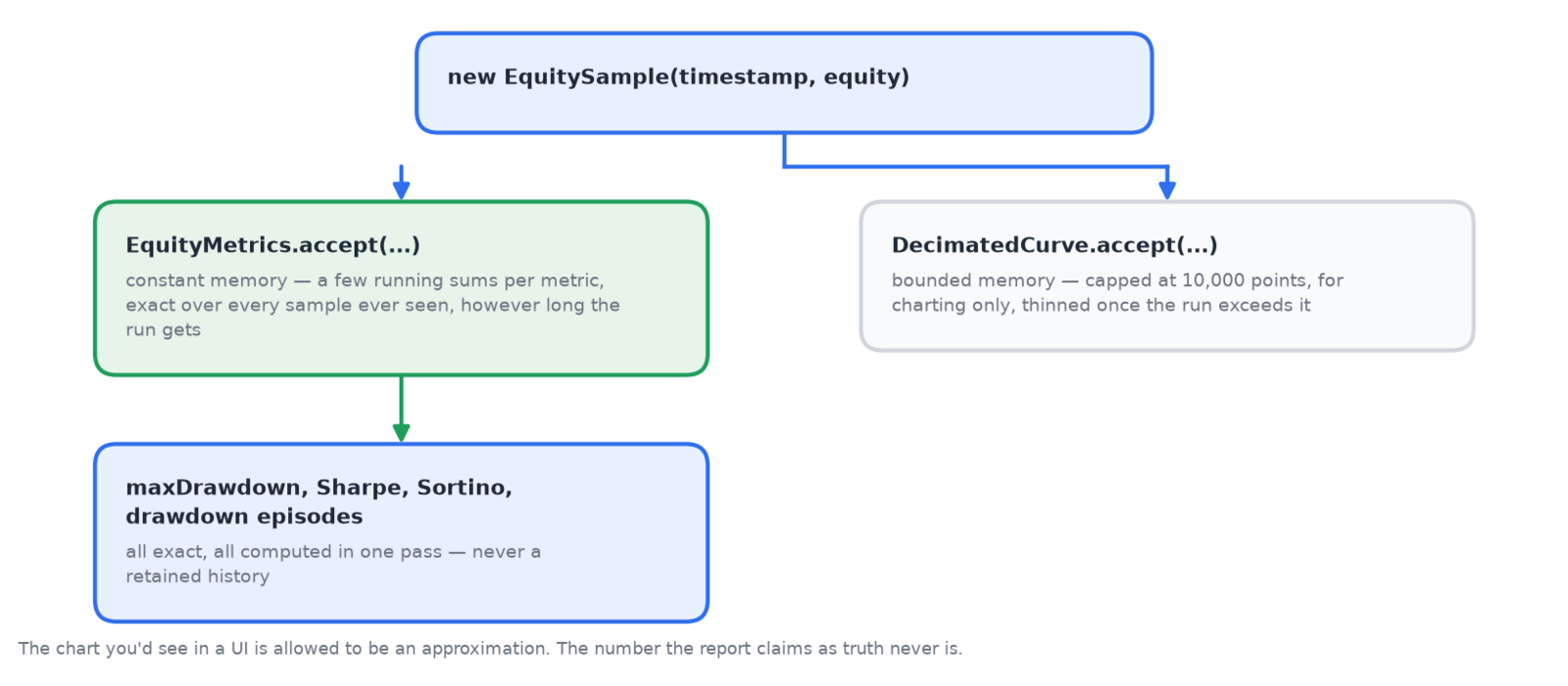 Figure 9.1 — Two different memory contracts for two different jobs. The chart is allowed to be an approximation; the metrics never are.
The exact side of that split isn’t new machinery invented for this chapter — EquityMetrics literally reuses the same MaxDrawdownAccumulator Chapter 6 introduced for the risk engine’s live drawdown halt. Same class, same online, constant-memory shape you’ve now seen for candles, for risk, and here for reporting: hold a few running numbers, fold in one new reading at a time, never retain the whole history to answer a question about all of it. The chart you’d see in a UI is allowed to be an approximation of the run; the number the report actually claims as truth never is.
Turning a wobbly line into one honest number#
Before looking at any specific ratio, it’s worth being precise about the two raw ingredients every one of them is built from, because the names — Sharpe, Sortino, Calmar — sound like they belong to a different discipline than trading, when really they’re just careful ways of asking a question any trader already asks by instinct: not just “did I make money,” but “how rough a ride was it to get there.”
The first ingredient is a return: not “profit” in dollars, but the percentage change in equity from one reading to the next. A $10,000 account gaining $100 in an hour and a $100,000 account gaining $1,000 in the same hour are both a 1% return — the same achievement, scaled so accounts of different sizes can be compared on equal footing. Walk the whole equity curve this way and you get a long list of returns, one per reading: some positive, some negative, some tiny, some large.
The second ingredient is a way of describing how much those returns bounce around. Two strategies can have the identical average return and still be nothing alike: one whose returns cluster tightly around that average, bar after bar, calm and predictable — and one whose returns are scattered wildly above and below it, a coin flip every time even though it averages out the same. The size of that scatter is what statisticians call variance (and its square root, in the same units as the returns themselves, standard deviation) — a single number for “how wild are the swings,” independent of whether any individual swing was good or bad.
Put those two together and you get the entire idea behind every ratio in this chapter: reward earned, divided by pain endured to earn it. A strategy that returns 1% a month like clockwork and a strategy that returns 1% a month by swinging between +20% and −18% are not equally good bets, even though their average is identical — and a single number that divides the average by the wobble tells you which is which, immediately, without you having to eyeball a chart.
One more piece, and then the payoff. A return measured over 125 one-minute bars and a return measured over a full year of daily closes aren’t naturally comparable — different strategies trade at wildly different frequencies, and “1% over three days” and “1% over three months” are not the same feat. So every one of these ratios gets annualized: scaled up as if the observed rate of return and risk continued, unchanged, for a full year, so a strategy trading once a minute and a strategy trading once a week land on the same yardstick. That scaling is completely mechanical, and — as the next section shows — completely capable of turning an unremarkable number into a spectacular-looking lie if you don’t feed it enough real data first.
What actually happened when I ran this#
Here’s where it gets genuinely interesting, and where a real run makes the point better than any explanation could. I built a small synthetic price series — BTC climbing cleanly for forty minutes, falling for forty, then climbing again for forty-five — and ran it through qkt’s own momentum example:
$ qkt backtest examples/tutorial/momentum.qkt --from 2024-01-15 --to 2024-01-16 \
    --starting-balance 10000 --data-root <local fixture> --no-fetch --allow-incomplete

Trades:           1
Final unrealized: 132.00000000
Total PnL:        132.00000000
Sharpe (annual):  434.96078838
Sortino (annual): n/a
Calmar:           n/a
Max drawdown:     0.00000000
Read that Sharpe number again. 434.96. A real hedge fund would frame a Sharpe of 2 on its office wall — a Sharpe ratio, remember, is just that reward-over-pain number from the last section, annualized. My toy strategy, on a hand-drawn 125-minute price series, is reporting two hundred times that, and it isn’t a bug. It’s the formula working exactly as designed, on exactly the kind of input that formula is dangerous to trust.
The engine’s actual computation is the mean of all those per-bar returns, divided by their standard deviation, multiplied by the square root of the annualization factor. Every step of that is checkable, so let’s check it.
The annualization factor is however many bars fit in a year. On a 24/7 crypto calendar with one-minute bars:
365.25 days × 24 hours × 60 minutes  =  525,960 bars per year
              √525,960               ≈  725
That square root is the whole trick. Sharpe scales with the square root of time — a consequence of returns compounding while their randomness accumulates more slowly — so going from a per-bar figure to a per-year figure multiplies by 725, not by 525,960.
Now run it backwards. If the reported annual figure is 434.96 and the multiplier was 725, then the raw per-bar ratio the strategy actually achieved was:
434.96 ÷ 725 ≈ 0.600.60. That is the real measurement — the mean of the per-bar returns divided by their standard deviation, before anything was scaled. It is an unremarkable number. It describes a strategy whose average bar was modestly positive relative to how much its bars bounced around, over about two hours. Nothing about that number should alarm anyone. But multiply an ordinary-looking 0.60 by 725, and you get a headline that looks like it belongs to the greatest trading strategy ever built, when what actually happened is: a hand-drawn price series with almost no chop in it produced an almost perfectly smooth equity curve over a couple of hours, and the annualization math extrapolated that couple of hours into a full year with total, unwarranted confidence.
This is the real lesson, and it’s a famous trap for exactly this reason: Sharpe rewards smoothness, and a short or artificially clean sample is always smoother than reality will turn out to be. A strategy backtested on too little data, or on unusually quiet conditions, will report a Sharpe that looks incredible — right up until it trades through a real, noisy month and the number collapses. The formula isn’t lying. It’s answering exactly the question it was asked, and the question was asked of a sample too small to deserve an answer that confident.
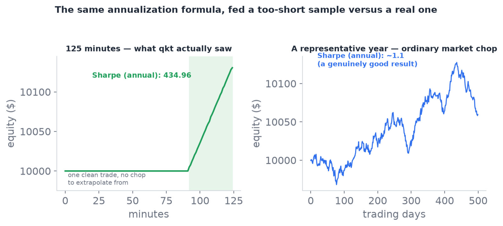 Figure 9.2 — Same annualization math, two different inputs. A too-short, too-clean sample turns an unremarkable per-bar ratio into a headline number; a full year of normal chop reports what a genuinely good Sharpe actually looks like.
When the honest answer is “n/a”#
Notice what Sortino and Calmar did instead of playing along: they refused to report a number at all. That’s not a gap in the tool — it’s the same discipline Chapter 7 built into BigDecimal division, showing up again at a different layer. Sortino is built exactly like Sharpe, except its “pain” measurement only counts the bad swings — the standard deviation computed using nothing but the negative returns, ignoring every good one entirely, on the theory that nobody actually minds a pleasant surprise. My synthetic run, after the single entry, only ever climbed — there was no downside in the sample at all, so that denominator is genuinely, mathematically zero, and the accumulator says so rather than guessing:
val downsideVar = sumDownside2.divide(n, Money.CONTEXT)
if (downsideVar.signum() <= 0) return null   // undefined, not zero
Calmar divides total return by the worst peak-to-trough loss anywhere in the run (max drawdown — covered in full in the next section), and my run’s max drawdown was exactly zero — the position never once dipped below its entry:
fun calmar(totalReturn: BigDecimal, maxDrawdown: BigDecimal): BigDecimal? {
    if (maxDrawdown.signum() == 0) return null
    return totalReturn.divide(maxDrawdown, Money.CONTEXT)...
}
Dividing by zero here isn’t a small number rounded away — it’s genuinely undefined, exactly the non-terminating-division problem from Chapter 7 wearing a different costume. Printing some fabricated large number instead of null would be worse than useless; it would look like an answer. n/a is the only honest thing either metric could say about a run that never had a bad moment to measure against.
Three ratios, three different questions#
Once you’ve seen Sharpe get fooled by a too-clean sample, it’s worth being precise about why Sortino and Calmar exist as separate numbers rather than “a more accurate Sharpe.” They’re not competing estimates of the same thing — each one is answering a genuinely different question a different audience actually cares about.
Sharpe asks: how smooth was this, statistically, counting every wobble — up or down — as risk. That’s the right question for comparing strategies the way a quantitative risk desk does, where volatility itself is the cost (it eats into leverage, capital allocation, everything). Sortino asks the sharper version: I don’t actually mind good surprises, only bad ones — how smooth was the downside specifically. Calmar asks the question an individual trader deciding whether they could survive a strategy actually cares about most: forget the statistics entirely — what’s the single worst peak-to-trough beating I would have had to sit through to earn this return? A strategy can be statistically excellent by Sharpe and still be Calmar-terrifying, if its one bad stretch was brief but brutal. Three numbers, three different kinds of trust, deliberately kept apart rather than blended into one.
A drawdown has a shape, not just a depth#
Max drawdown — the number Calmar divides by — is the single worst percentage the account ever fell from a prior high point (its “peak”) before recovering: not the total loss for the run, just the deepest hole dug at any one stretch. It’s a single magnitude. But two drawdowns of the identical depth can be completely different experiences to actually live through, and qkt tracks that difference separately, as drawdown periods:
// e.g. 100 → 120 → 108 → 120 records one period: peak 120, trough 108, depth −10%, recovered.
class DrawdownEpisodeAccumulator(private val threshold: BigDecimal) { ... }
A period is the whole episode — when the peak happened, when it bottomed (the “trough”), how long recovery took — not just the depth. A −10% drawdown that recovers in three days barely registers as a decision point; a −10% drawdown that takes eight months to climb back out of is a genuinely different, far scarier thing to hold real capital through, even though “max drawdown: −10%” reports the identical figure for both. Shallow episodes below a −1% threshold are filtered out entirely, because near-flat noise isn’t a drawdown anyone needs reported — the same “don’t report what isn’t real signal” instinct that governs everything else in this chapter.
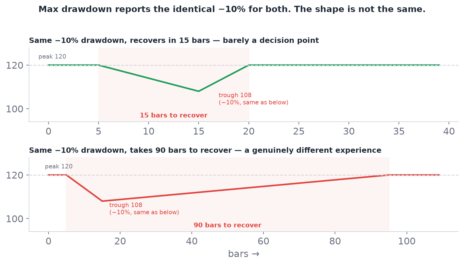 Figure 9.3 — “Max drawdown: −10%” is the identical headline for both curves. One is a brief dip; the other is a long stretch of real capital sitting underwater.
 DrawdownEpisodeAccumulator is what tells them apart.
The number that moves when you change how you look#
There’s one more honesty problem in this chapter, and it’s the subtlest, because it isn’t a bug and nothing in the report looks wrong when it happens.
Annualizing needs to know how many periods there are in a year, and that depends on how often the equity curve was sampled. Sample once per closed bar and the engine works it out from the trading calendar. Sample on some other cadence and it infers the figure from the average spacing between the samples it actually received, falling back to the conventional 252 trading days only when the data is too sparse to say. All of which is reasonable — and all of which means the same run, over the same data, producing the same trades, can report a different Sharpe depending on the cadence you chose for sampling.
Sit with that for a second, because it’s a different species of problem from the one earlier in this chapter. The 434.96 was a real number honestly computed from a too-small sample. This is a real number honestly computed from a defensible choice that a reader would never think to ask about. The report names the cadence it used for exactly this reason: a ratio is only comparable against another ratio measured the same way, and quietly comparing two Sharpes sampled differently is a mistake the tool can warn you about but cannot prevent.
The same instinct shows up in a much smaller decision. A drawdown episode only gets recorded if it goes deeper than −1%, a threshold fixed in the code with no user-facing lever. Above that line you’d be reporting ordinary noise as though it were an event, and a list of two hundred trivial “drawdowns” is worse than no list at all. Below it, you might miss a shallow-but-long episode that mattered. It’s a judgment call, made once, applied everywhere — and worth knowing exists rather than discovering when a −0.9% grind doesn’t appear in a report.
What a report is actually for#
Go back to the two strategies this chapter opened with. A report built the way this one is doesn’t just add more numbers to look impressive — it makes it structurally impossible for a strategy that got lucky once to hide behind the same headline as a strategy that earned its return the hard way. Strategy A’s suspiciously smooth path to $10,000 would report a Sharpe that looks incredible for exactly the reason mine did, and a Calmar or a set of drawdown periods that a careful reader would immediately want explained. Strategy B’s slower, steadier climb would look boring by comparison — which is precisely the point. A backtest report’s job was never to produce one exciting number. It’s to make a strategy’s character impossible to fake, one honestly-computed, occasionally-undefined statistic at a time.